Most people don’t think about design when an emergency vehicle races past them. There’s a siren, a flash of light, a rush of adrenaline—and instinct kicks in. You pull over. You stop. You make space. But behind that instant reaction is something deeply intentional. The colors, the patterns, the placement of text and symbols—all of it is designed to communicate urgency, authority, and clarity in a split second.
Emergency vehicles live in high-pressure moments. They operate in chaos, noise, weather, traffic, and darkness. In those conditions, design isn’t about looking good. It’s about being understood immediately.
Visibility Is Not a Style Choice
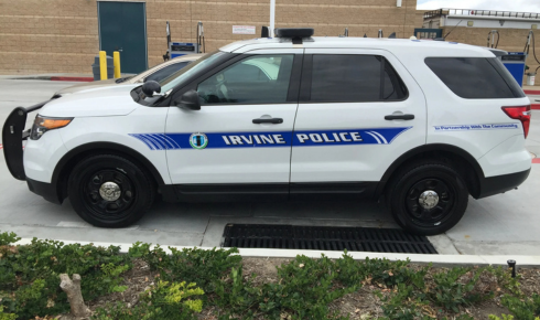
For ambulances, fire engines, police cars, and rescue units, visibility is the foundation of safety. A vehicle that blends into traffic is a liability. This is why emergency vehicle graphics rely so heavily on contrast, reflective materials, and standardized color systems. Fluorescent yellows, bold reds, stark whites—these aren’t aesthetic trends. They’re functional tools.
At night or in heavy rain, reflective striping can be the difference between being seen and being hit. During daylight, strong visual contrast helps drivers register a vehicle’s purpose instantly, even from peripheral vision. The goal isn’t subtlety. It’s recognition.
And yet, there’s a balance. Too much visual noise can actually reduce clarity. The best designs feel obvious without being cluttered.
Clarity Over Creativity—But Not Without Thought
There’s a misconception that emergency vehicle design is purely technical, with no room for creativity or nuance. That’s not quite true. While strict guidelines exist, there’s still space for thoughtful decision-making.
Fonts matter. Icon placement matters. The way information is layered—from vehicle number to department name to emergency contact—follows a hierarchy. In stressful moments, the brain processes simple shapes and high-contrast text faster than decorative elements. That’s why well-executed emergency graphics often feel almost invisible when done right. They don’t distract. They guide.
Designers working in this space understand that every line has a job. Every color must earn its place.
The Human Factor Behind the Design
It’s easy to forget that emergency vehicles are used by people—real individuals working long shifts, responding to situations most of us hope never to face. Good design supports them. Clear markings help with scene coordination. Consistent layouts reduce confusion when multiple agencies respond together.
There’s also a psychological aspect. Vehicles that look professional and well-maintained tend to command more respect on the road. Drivers are more likely to yield. Crowds are more likely to comply. That sense of authority doesn’t come from aggression—it comes from visual confidence.
This is where design quietly influences behavior, without anyone consciously noticing it.
Durability Is Part of the Message
Emergency vehicles don’t live easy lives. They’re exposed to extreme weather, frequent washing, chemical cleaners, and constant wear. Graphics that peel, fade, or crack don’t just look bad—they send the wrong signal.
A damaged vehicle graphic can undermine trust. It suggests neglect, even if the mechanical condition is perfect. That’s why material choice and installation quality matter just as much as the design itself. Longevity is not optional in this field.
Professionals in emergency vehicle graphics know that durability isn’t an add-on. It’s a requirement built into every decision, from vinyl type to edge sealing.
Consistency Builds Recognition
One of the strongest tools in emergency design is consistency. When vehicles within the same department share visual language, recognition becomes automatic. You don’t have to read the text—you just know.
This consistency also matters across regions. Standardized color schemes and layouts help drivers traveling from one city to another react correctly without hesitation. Familiarity reduces decision time, and in emergencies, milliseconds matter.
Consistency doesn’t mean boring. It means dependable.
Design as a Public Safety Tool
Unlike commercial graphics, emergency vehicle design isn’t selling anything. It’s serving the public. Its success isn’t measured in clicks or conversions, but in outcomes—fewer accidents, faster response times, safer scenes.
Good design reduces cognitive load. It tells drivers what to do without forcing them to think. It helps pedestrians understand what’s happening before panic sets in. It supports responders by making their presence clear and unmistakable.
In that sense, emergency vehicle design is a form of silent communication—always working, even when no one is paying attention.
A Thoughtful Ending
The next time an emergency vehicle passes you, take a moment—after it’s gone—to think about what you saw. Not the siren or the lights, but the way the vehicle looked. How quickly you understood its purpose. How instinctively you reacted.
That response didn’t happen by chance. It was shaped by deliberate choices, informed by experience, safety standards, and an understanding of human behavior under stress.